Design Diaries: A Darker Roast
When I wrote the first design diary for GrindLab last August, the app wore a palette I’d call latte: milky beige edge to edge, white icons in white circles, and the stock iOS blue tint doing accent duty because I hadn’t made a decision about color. It shipped that way, and for a year it worked. But revisiting those early screenshots while preparing for iOS 27, the problems were hard to unsee.
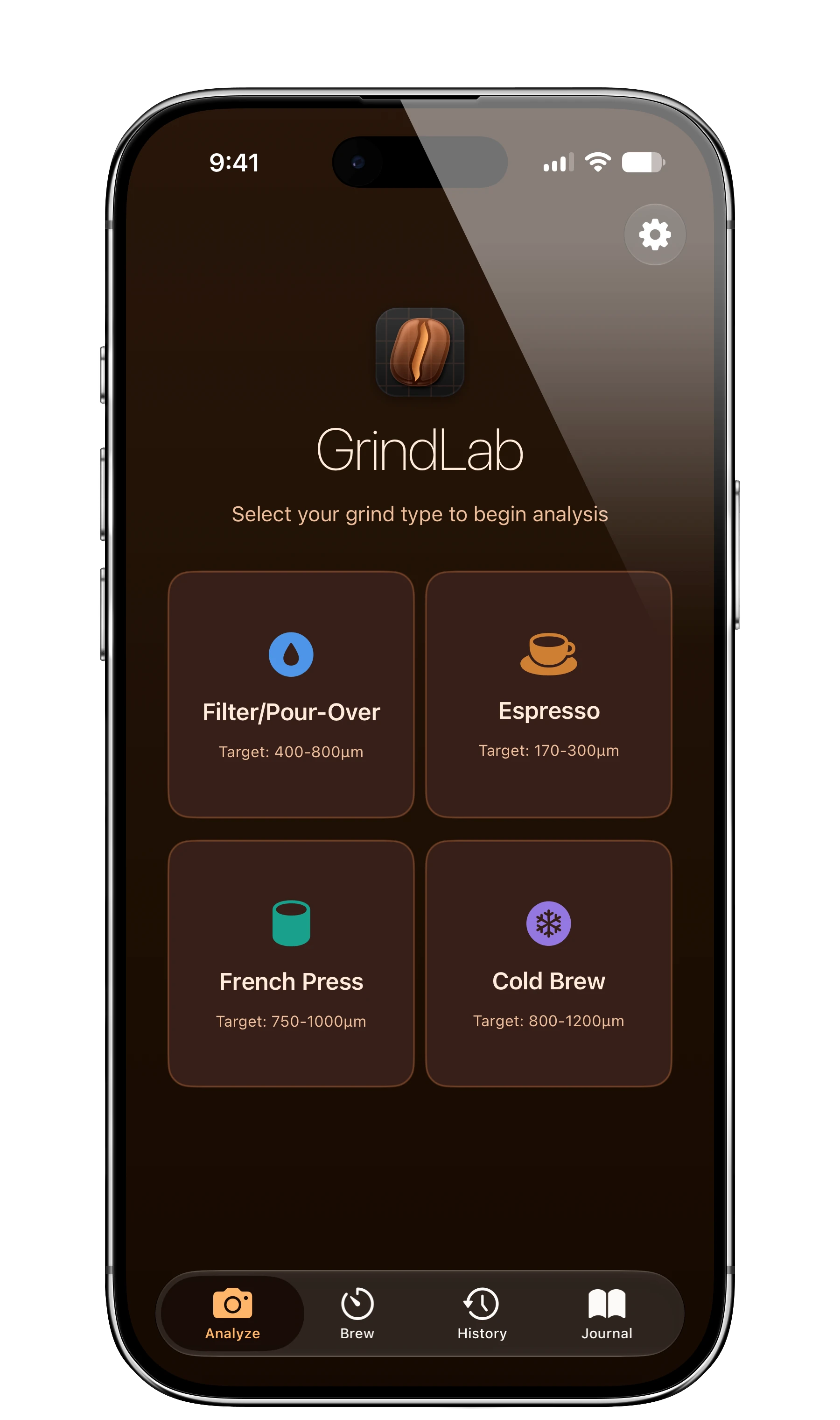
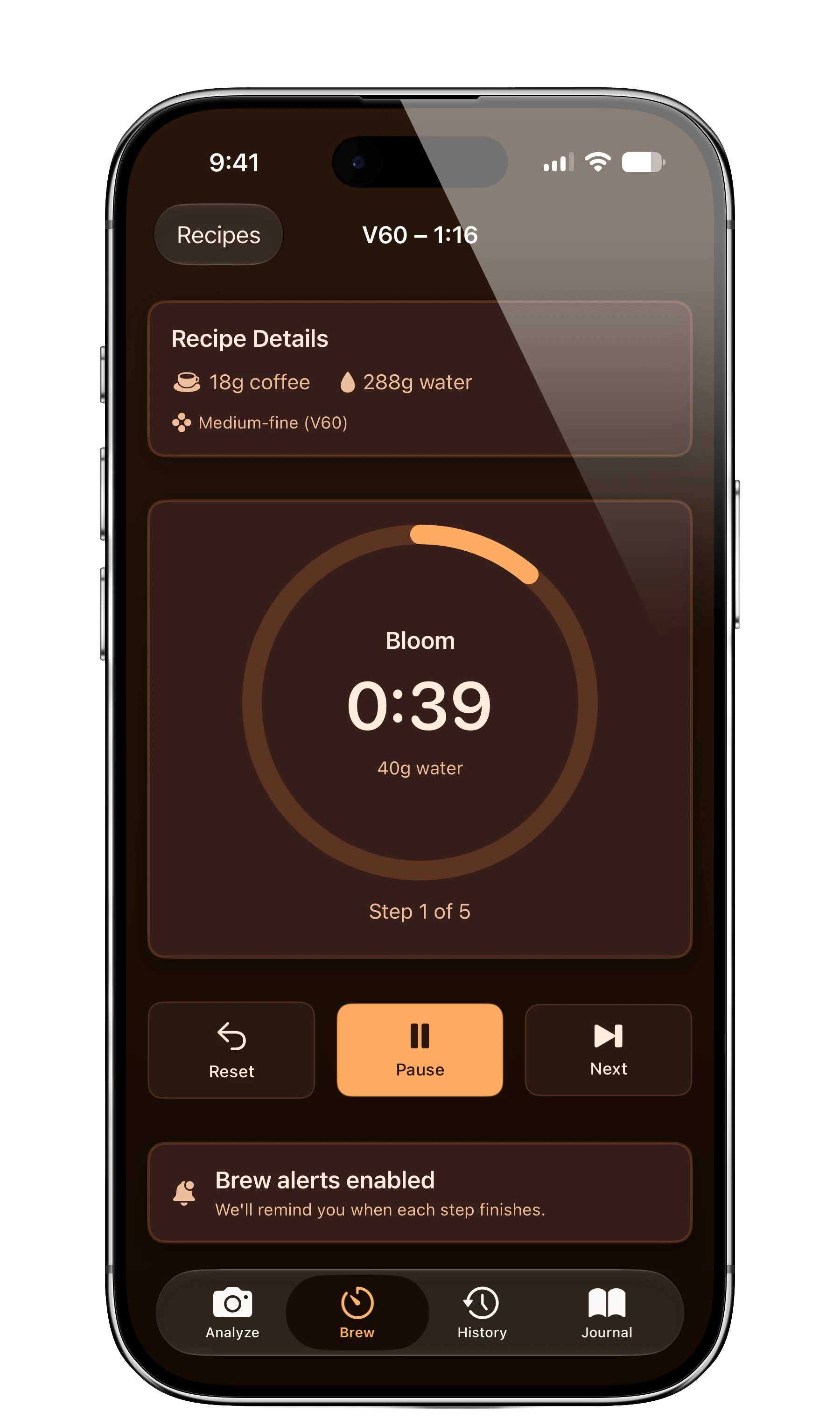
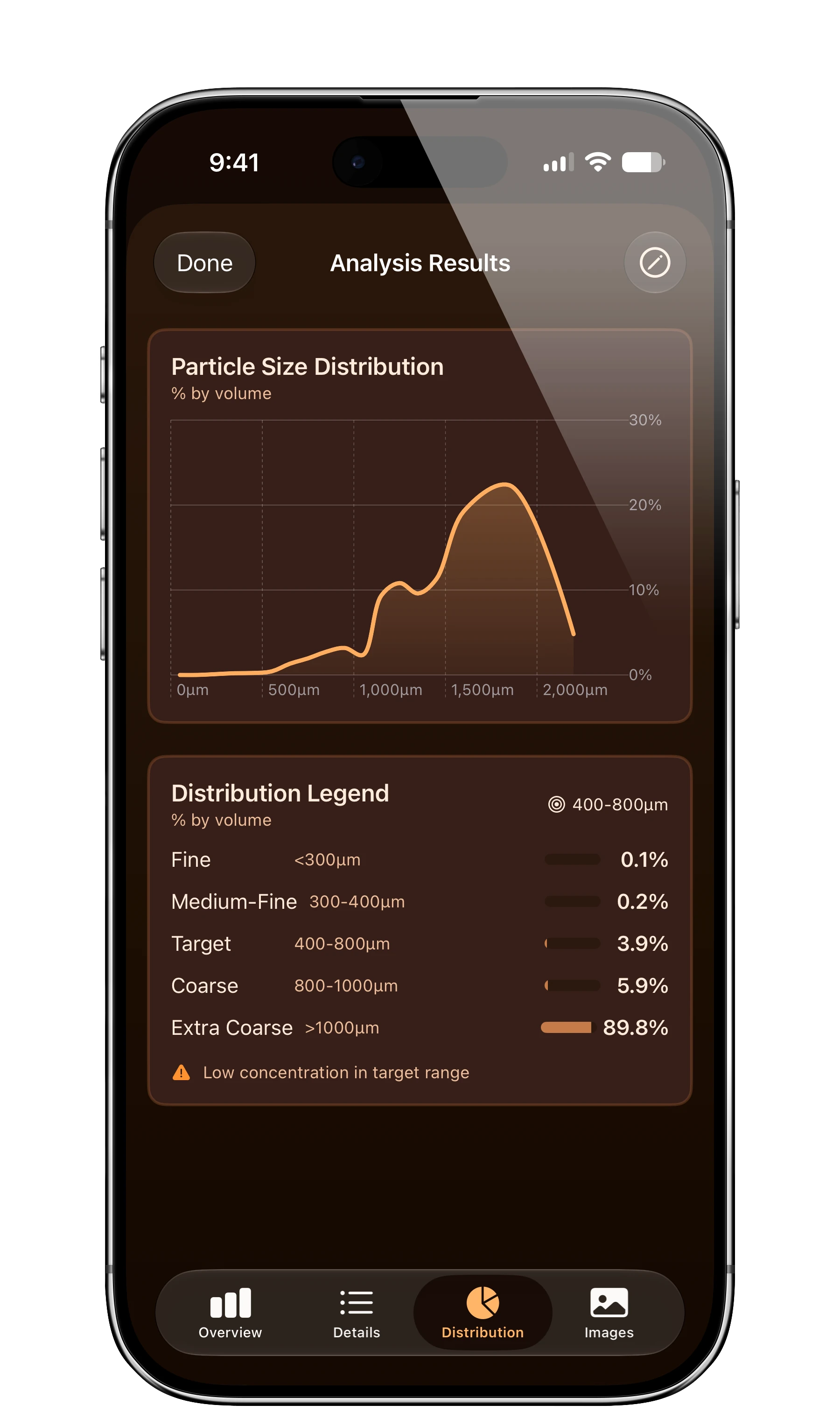
Everything was the same shade of cream — background, cards, tab bar — with so little contrast that the interface read as one flat surface. The brew method tiles were distinguishable only by their labels, and the default blue tint clashed with the warm palette everywhere it appeared. It was the color of no decision.
iOS 27 was the excuse I needed to make one.
Espresso, Not Latte#
The new foundation is a deep espresso brown — a true dark theme, but a warm one. The app now looks like the thing it measures. On that base, surfaces layer the way modern iOS wants them to: glassy cards sitting visibly above the background, a floating tab bar, controls with actual elevation. The flatness is gone.
The accent is now amber — the color of crema. It carries the brew timer’s progress ring, the distribution chart, the selected tab, the primary action on every screen. One warm accent against one dark ground, and the whole app finally agrees with itself.
Color as Information#
The four brew method tiles finally earn their icons: a blue drop for filter, an amber cup for espresso, a teal press for French press, a purple snowflake for cold brew. Each method has a color you learn once, and it follows the method through the rest of the app.
The analysis screens got the same treatment. The particle distribution chart — once a pair of thin lines lost against beige — is now a single amber curve with a gradient fill that makes the shape of your grind legible at a glance. The legend uses filled capsule bars, so the difference between 0.1% fines and 89.8% extra-coarse is visible before you read it. Warnings surface in amber instead of hiding in body text.
The app has grown from two tabs to four — Brew and Journal joined Analyze and History — and the tab bar now treats all four as equals, with the settings gear promoted out of the grid entirely.
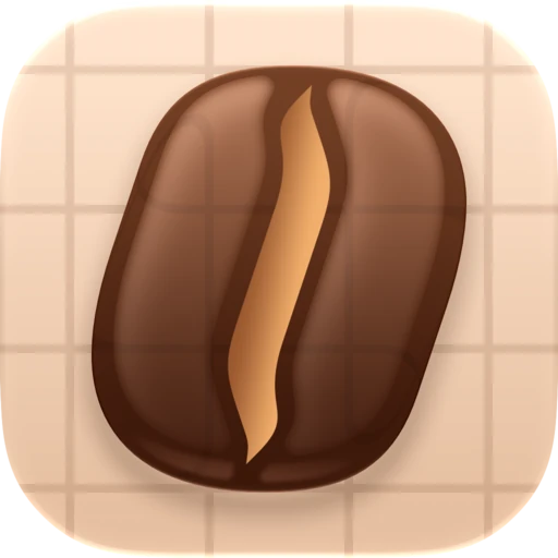
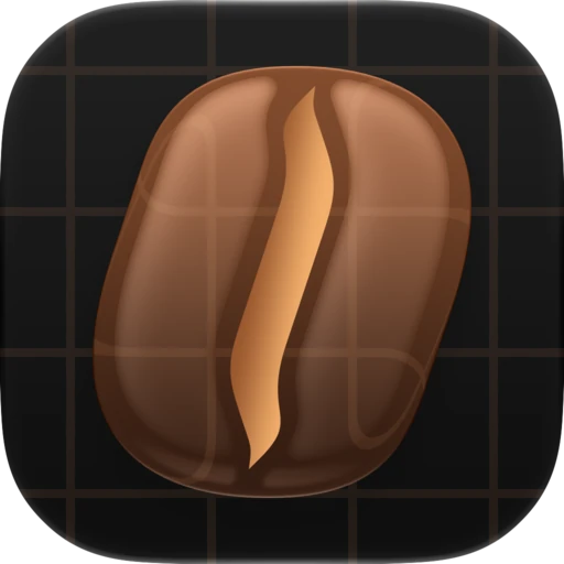
Even the app icon got reroasted — though not by me. Liquid Glass raised the bar for icons: iOS 27 renders them as layered, dimensional objects that catch light and shift with the system, and my flat line-drawn bean was never going to survive the transition. So I hired Parakeet, the two-person studio of Louie and Luka, to do it properly. They came back with a dimensional roasted bean built in real Liquid Glass layers — depth, translucency, a highlight that moves — and it sits on the home screen looking like it belongs next to Apple’s own icons instead of like a sketch of one.
But as I wrote in the flow diary, people rarely delete an app because the idea is bad — they delete it because the experience feels off in ways they can’t articulate. Low contrast is exactly that kind of off. You don’t notice that every surface is the same color; you just squint at a chart, or hesitate over four identical tiles. The overhaul pays down a year of those small hesitations at once.
The new design ships with the next update, alongside iOS 27 this fall. Still free, still entirely on-device — just easier on the eyes, in both senses.